
Norval Foundation audio tour app

An audio tour app for the Norval Foundation, an art gallery in Cape Town, South Africa.
The app aims to give visitors a deeper understanding of the artworks on show, with commentary from gallery curators, art historians, and even the artists themselves.
August 2023 - Jan 2024
The Problem:
Many gallery visitors struggle to understand the artworks they are viewing, lowering engagement with the gallery exhibitions.
Many visitors would benefit from a more immersive experience through an audio tour app.
The Goal:
Design an app for the Norval Art Foundation that allows users a deeper understanding of the artworks they are viewing.
Responsibilities:
Defining personas, competitive audits, conducting interviews, paper and digital wireframing, low and high-fidelity prototyping, conducting usability studies, iterating on designs, accounting for accessibility.
Understanding the user
User research | Personas | User journey maps | Problem Statements
User research summary:
The research process involved conducting interviews which brought forth three relevant pain points for gallery visitors. The research revealed that a primary user group is people with an interest in the arts, who want to know more about the work at galleries they visit.
The interviews revealed a need for audio assistance for some participants for a number of reasons. Further, it pointed to users wanting to know more about the work that they were seeing, where explanations within the gallery are often limited. An audio tour app solves this problem as it provides an elegant way to bring relevant information to visitors whilst they view the artworks. The interview responses were used to create a persona that best represents the core desires and concerns of a potential user.
The decision was made to center around a persona that would most benefit from the audio tour app due to need,. However, from my research, I would argue that the vast majority of users would engage more deeply with the works through a curated audio tour, and therefore that the app would improve the experience for almost all visitors.
Pain points:
The research process found these three issues recurrent amongst participants, and therefore worthy of design consideration.
1
Poor experience of exhibitions
Having long text descriptions in galleries can distract users from focusing on the art, limiting their experience of the exhibition.
2
Accessibility
Most text descriptions in art galleries are difficult to access for those who either aren’t first language english speakers or have difficulty reading.
3
Time
Some users don’t have time to read all the text descriptions of art works and would rather access a description while viewing the art.


Problem statement:
Aisha is a working professional with dyslexia who loves going to art galleries but struggles to immerse herself in the artwork at exhibitions due to difficulty reading text descriptions that explain the exhibitions to viewers. She finds that many of the artworks have lengthy descriptions which slow her down and cause a frustrating experience.
Paper wireframes | Digital wireframes | Low-fidelity prototype | Usability studies
Starting the design
Paper wireframes:
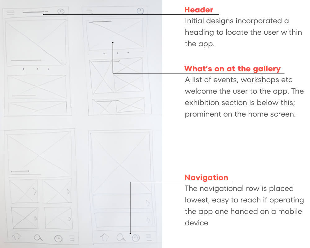
Wireframing proved a useful tool for quickly generating layout ideas and formats. For the landing screen, the design intent was to welcome the user to the gallery and show them the extent of events, exhibitions and workshops that the foundation had to offer.
Landing page design:
For the landing screen, the design intent was to welcome the user to the gallery and show them the extent of events, exhibitions and workshops that the foundation had to offer.

Current exhibitions page:
When designing for this portion of the app, I experimented with different ways of presenting the list of exhibitions. I played with increasing the size of the corresponding images, making all the exhibitions the same weighting through size, reducing the text descriptions, and altering the size of the elements on the page to establish hierarchy.
Digital wireframes:
Initial digital wireframes developed on the paper wireframes, lending more focus to the weighting of different sections on the landing page.

Low-fi prototype
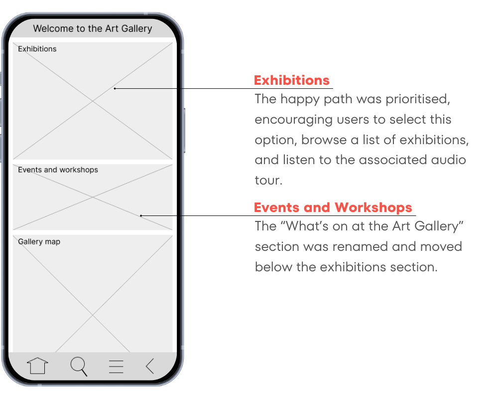
The low fidelity prototype was updated following two rounds of user testing. The approach to the design of the homepage moved towards a simpler and more clear user flow along the “happy path”: encouraging the user to choose an exhibition, listen to the associated audio description, and then proceed to the audio tour of the artworks.
Click on the link to view the low-fidelity prototype.
Usability studies:
Two rounds of studies were conducted on the initial low-fidelity prototypes to understand how potential users were perceiving the application, with a focus on any areas of confusion that arose.
Round 1 findings
1) The section “what’s on at the art gallery” was confusing for some users.
2) Audio playback interface was unclear for some users.
3) Some participants suggested the search function be broadened.
Round 2 findings
1) Some primary navigation elements weren’t acting as expected.
Some design updates were made following the confusion regarding the “what’s on in the gallery'“ section in the first round of the study. The feedback from the second round of the study indicates that these areas of confusion had mostly been seen to. Refer below the updated landing page design following the first round study.
Landing page design update:
The homepage was reworked slightly, with the Exhibitions section shifted to the top of the picture frame, and the “What’s on” section renamed “Events and Workshops” below to avoid user confusion with regards to the section contents.
Refining the design
Mockups | High-fidelity prototype | Accessibility
Mockups:

Landing page updates
Through the design process, early designs were revised to include negative space between the image sections. This minimises visual clutter and allows the images to breathe better. The text descriptions also assist to guide users through the app more effectively.

Exhibition preview updates
The number of images per exhibition preview was reduced through the design process, opting for a single key image per exhibition to grab user’s attention. Text descriptions were dulled down, grey on white background, to focus the user on the images and headings.

High-fi prototype
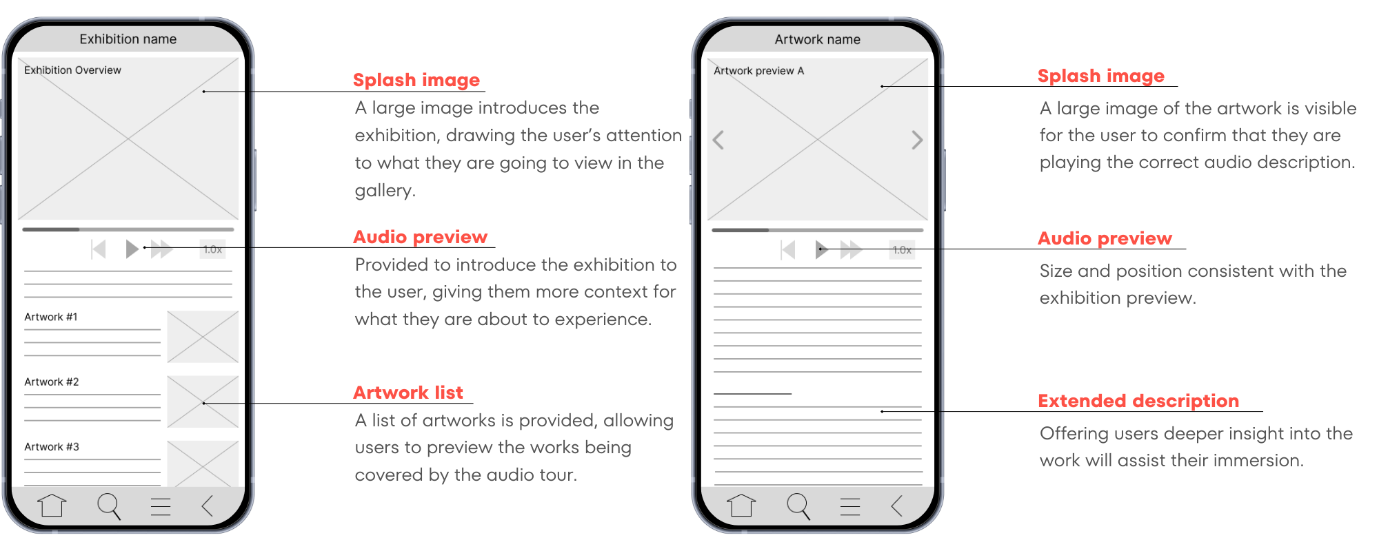
The final product sorted a large volume of exhibition and artwork information into an intuitive system for the audio tour setup.
Click on the link to view the audio tour app high-fidelity prototype.

Accessibility considerations:
1
Experiencing the exhibition
The app improves the accessibility of the gallery, giving audio tours of the artworks for those who would otherwise struggle accessing descriptions of the works.
2
Multiple mediums
Use of both images and text offers the user multiple methods of wayfinding through the app.
3
Incorporating icons
The use of icons assists user navigation within the application.
Going forward
Takeaways | Next steps
Takeaways:

Impact
The audio tour app will provide Norval Foundation visitors with an immersive experience for exhibitions they view. This app would provide assistance for those unable to read the text descriptions present at art galleries, or for those who desire to better understand the art, offering more content than would normally be on display.

What I learned
Usability studies revealed that users often see the design in totally new ways that one had not considered. These differing perspectives formed valuable feedback that allowed for design iterations that led to the development of the design. Shifting fidelities within the process helped to highlight areas of concern with initial design ideas.
Next steps:
1
Consider usability studies to assess whether user pain points have been sufficiently mitigated.
2
Conduct more user research with art gallery enthusiasts to determine any other areas of need that the product may be able to address.

Let’s collaborate!
Hey, thanks for taking the time to review my work.If you have an idea that we could collaborate on, or want to know more about my process, feel free to drop me a message!