
Norval Foundation website rework


A redesign for the desktop and mobile websites for an art gallery in Cape Town.
The new design assists users in planning their visit to the gallery, integrating the booking system into the website.
December 2023 - February 2024
The Problem:
Potential visitors want to find out more about the Norval Foundation, its current events and exhibitions, and plan their trip to the gallery.
The Goal:
Redesign the Norval Foundation website (desktop and mobile) to give users a simple, intuitive way to see what is on at the gallery and plan their next visit.
Responsibilities:
Defining personas, competitive audits, conducting interviews, paper and digital wireframing, low and high-fidelity prototyping, conducting usability studies, iterating on designs, accounting for accessibility.
Understanding the user
User research | Personas | User journey maps | Problem Statements
User research summary:
To better understand user needs, I conducted user research through interviews. Interview findings were analysed and used to create user personas. The primary user group is people interested in the visual arts, who want to find out what is on show at the gallery and plan their visit to the Norval Foundation.
The interviews revealed a primary desire to find out what was going on at the gallery, including current events and exhibitions. Users also wanted to plan their visit to the gallery and be able to book their tickets ahead of time out of convenience.
Pain points:
The research process found these three issues recurrent amongst participants, and therefore worthy of design consideration.
1
Gallery information
Users wanted to find out specific gallery information such as location and opening hours ahead of time to assist them in planning their visit.
2
Planning a visit
Users wanted to be able to plan and book their visits, handling the payment and logistics online and ahead of time to be assured of their visit.
3
Exhibitions and event information
Users wanted to find out about more information about specific events and exhibitions without having to visit the gallery to enquire.


Problem statement:
Raoul is a student new to the city of Cape Town who needs to find out about exhibitions and plans visits to the gallery for himself and his classmates because he wants to make friends while exploring the culture of his new city.
Paper wireframes | Digital wireframes | Low-fidelity prototypes | Usability studies
Starting the design
Paper wireframes:
For the landing page I decided a large, bold image would introduce the gallery well. From this page, the user is able to move through the website in a nonlinear sequence, and when ready is encouraged to plan their visit and book tickets.
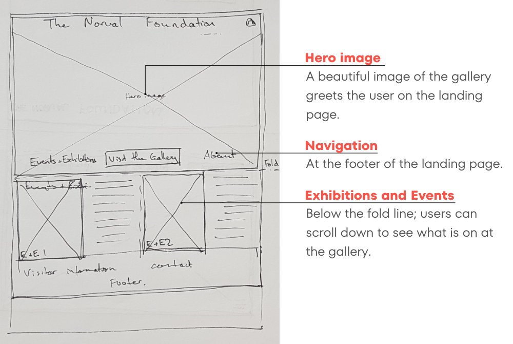
Landing page design (desktop):
For the landing page I decided a large, bold image would introduce the gallery well. From this page, the user is able to move through the website in a nonlinear sequence, and when ready is encouraged to plan their visit and book tickets.
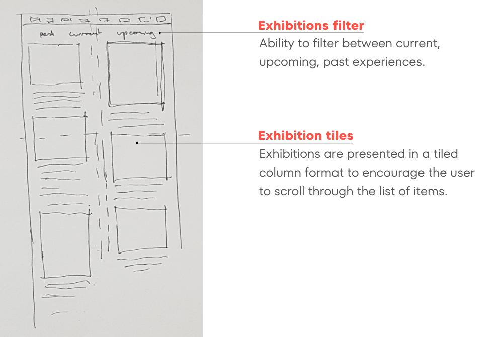
Current Exhibitions page design (desktop):
For the current Exhibitions pages, I had to condense a large amount of disparate information into the visible screen, so opted for two columns of information that would lead the viewer’s eye down the page and encourage them to continue scrolling the content on the page.
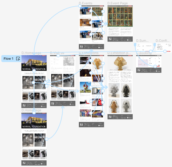
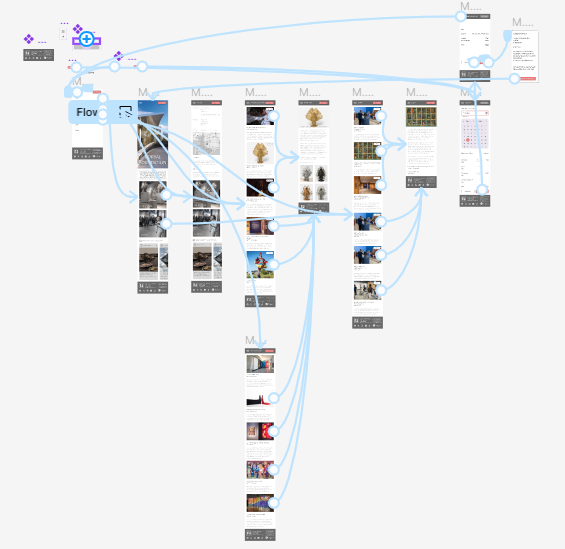
Digital wireframes:
Initial digital wireframes consolidated the hand drawn designs while considering more precise elements. Mobile and desktop designs were considered simultaneously, however primary focus was placed on the desktop site version due to more of the Norval Foundation’s traffic being desktop-based.

Desktop and Mobile - Landing page

Desktop and Mobile - Visit Us page
Desktop and Mobile - Exhibition page
Desktop and Mobile - Booking page
Low-fi prototypes
As the design process proceeded, care was taken to keep the desktop and mobile versions similar so that the user experience would feel familiar to users switching between formats. Below are the two prototypes, each illustrating the happy path for the design, which encourages users to plan their visit to the gallery and purchase tickets.
View the desktop prototype here.
View the mobile wireframe here.
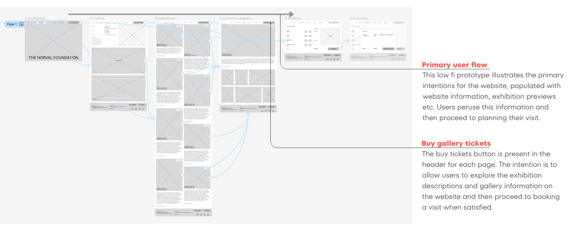
Desktop prototype
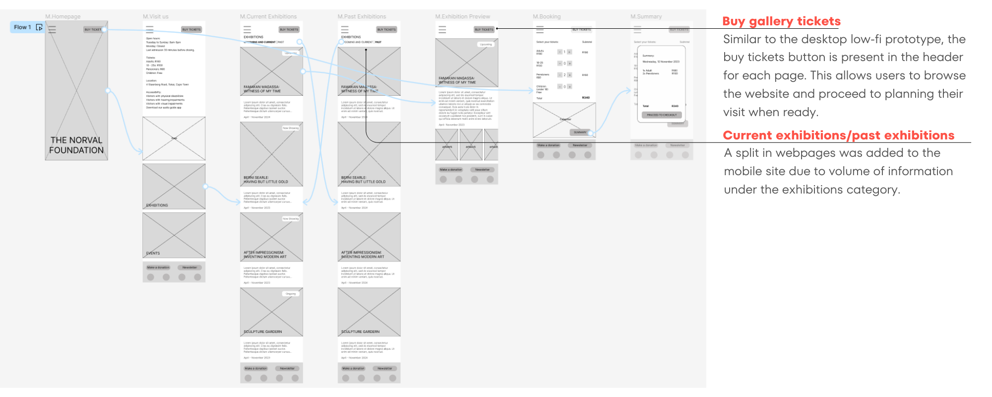
Mobile prototype
Usability studies:
Two rounds of moderated usability studies were conducted on the initial low-fidelity prototypes to understand how potential users were interacting with the product. The latter study indicated an improvement in user perception and users found the product clear and simple to use.
Round 1 findings
1 Users were unsure as to their location within the website.
2 The amount of information on certain pages could be increased -exhibitions, events.
3 Mobile users noted the calendar could be made clearer when booking tickets.
Round 2 findings
1 The booking system didn’t request an email address to direct tickets to, defaulting to the account email address. This could cause some confusion.
Refining the design
Mockups | High-fidelity prototypes | Accessibility

Mockups:
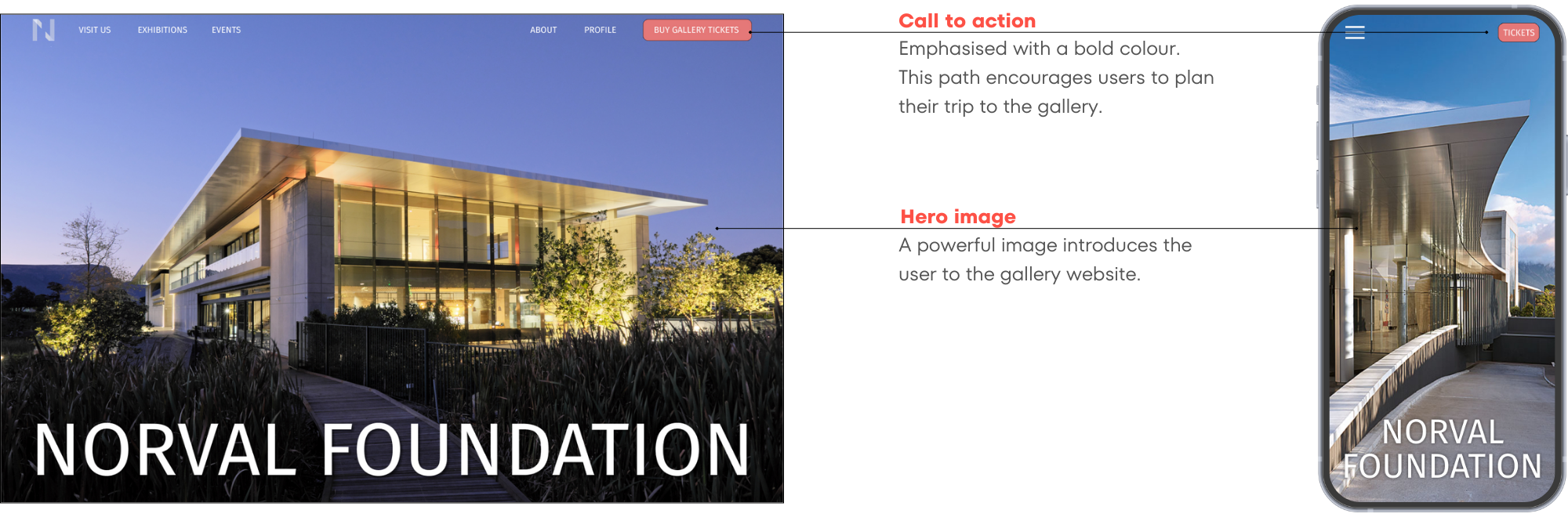
Landing page design
The simple ‘hero image’ homepage design was retained following the usability study. The navigation bar was separated on desktop to give more focus to the hero image.

Visit us page design
The main visitor information is in text format and was placed at the top of the page with a map to assist visitors to locate themselves. The same two-column format was carried over from the wireframing stage. A social media section was added to encourage visitor interaction with the gallery online.

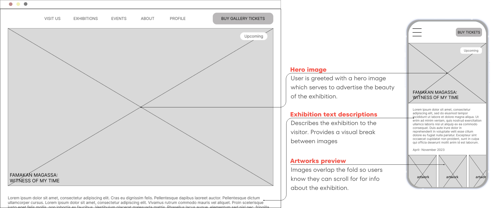
Exhibition page design
The design is similar to the wireframe, the main change is on the mobile site - with the inclusion of the hamburger menu, past exhibitions could be separated into a different section. Therefore the option on the exhibition page to navigate to past exhibitions has been omitted.

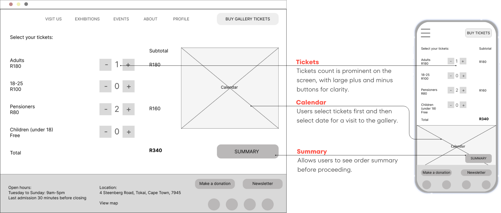
Booking page design
The calendar on the booking page shifted from right hand side of screen to left hand side. This change was made to better align to user thinking - user thought process is more likely to select a date for visiting first, and then choose number of tickets.
High-fi prototype
The design for the high-fidelity prototype puts the artworks and images as the primary focus of the website, with other UI elements being downplayed with muted grey tones. The main CTA is in bright red, encouraging users to plan their trip to the gallery by booking tickets.
View the desktop high-fidelity prototype.
View the mobile high-fidelity prototype.
Accessibility considerations:
1
Simple interface
The simple typeface within the design gives clear emphasis to heading elements over normal text without becoming too difficult to read.
2
Images and text
Images are combined with text to guide users towards towards desired sections in the website, assisting users to better understand the contents of the app.
3
Icons
The use of icons assists user navigation within the application.
Going forward
Takeaways | Next steps
Takeaways:

Impact
The new Norval Foundation website provides a simple, clean design, allowing users to peruse gallery information at their leisure. The incorporation of a clear CTA encourages users to plan their visit the gallery to experience the exhibitions and events firsthand. This would hopefully translate to increased ticket sales.

What I learned
Designing for different platforms presented opportunities for growth that were unforeseen prior to starting the design process. By designing for desktop and mobile screen sizes, the primary target was to maintain consistency across the two experiences. I feel this has been well achieved within the project.
Next steps:
1
Consider usability studies to assess whether user pain points have been sufficiently mitigated.
2
Conduct more user research with art gallery enthusiasts to determine any other areas of need that the product may be able to address, such as integration with the audio tour app etc.

Let’s collaborate!
Hey, thanks for taking the time to review my work.If you have an idea that we could collaborate on, or want to know more about my process, feel free to drop me a message!